Did We Tame Inflation With No Economic Cost? The Sacrifice Ratio Has the Wrong Sign
Using a common method (Ball 1994) for estimating the recent output sacrifice ratio gives us a value of -0.04. That's not just small - many values are between 2-3 - but it actually has the wrong sign.
How costly will it be to bring down inflation? This is one of the big questions in macroeconomics, and it’s been one of the most important questions over the past few years as inflation spiked following the pandemic.1
Sacrifice Ratio
There’s one common approach to answering this called the sacrifice ratio: how much of an economic cost is born, generally measured in terms of lost gross domestic product (GDP), per each percentage point of lower inflation. This formulation of the question rests on a pillar of economic theory called the Phillips curve. While there are many types of Phillips curve, the basic intuition is that inflation is a positive function of demand-driven economic activity pushing against aggregate supply. One version of the Phillips curve is the so-called adaptive expectations Phillips curve:
Where ỹ is the output gap, or the percent deviation of output from potential output, and v represents cost-push shocks. We can see with some algebra2 that the inverse of the slope of the Phillips curve is a version of the sacrifice ratio—to decrease inflation by one point, output would need to fall by 1/β output gap points.
Trying to estimate the range of values this takes, and what might influence it, has been one of the empirical challenges of macroeconomics in recent decades.
How has the literature approached its measurement? There’s one straightforward method created by Lawrence Ball (Ball 1994) that is common in the literature, and is generally the benchmark other estimates base themselves against, e.g. (Tetlow 2022). Ball (1994) identifies disinflationary episodes and the denominator is how much trend inflation fell.3 We just went through one of those, as we did in the early 1980s.
The numerator is how much lost GDP is sacrificed to bring down inflation, measured as the total loss of GDP relative to potential GDP. This requires us to determine what potential GDP is. Ball (1994) assumes GDP equals potential GDP at the peak of inflation, and 1-year after the trough of inflation, and then draws a log-linear line between those two points for potential GDP. Straightforward and, in comparison to more complicated measurements, it’s easy to follow and compare across many places and times.
Early 1980s Sacrifice Ratio
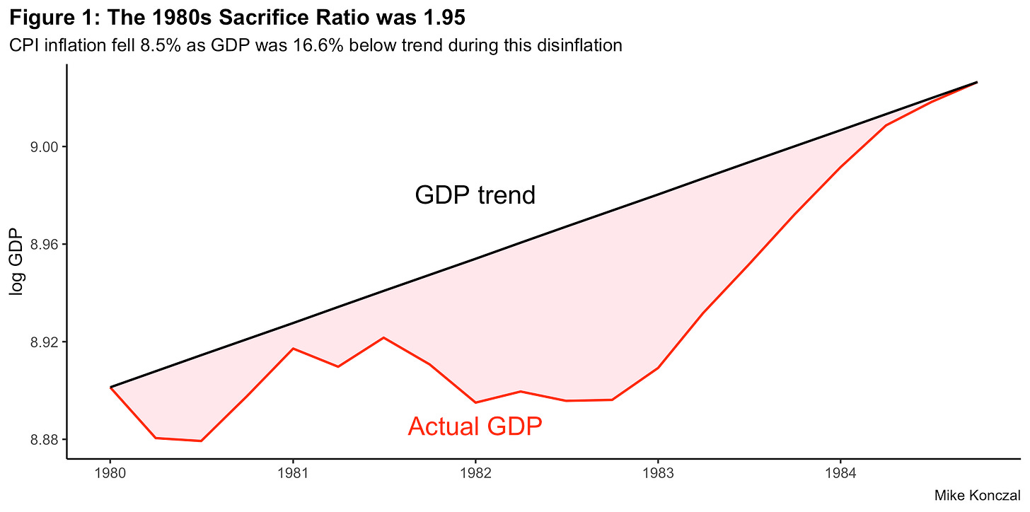
Figure 1 replicates the Ball (1994) methodology for the Volcker-era disinflation, from a peak of trend CPI inflation at 12.3% in the first quarter of 1980 through its fall to 3.8% in the first quarter of 1984. As you can see, the loss to GDP was quite high, at a cumulative 16.6% of GDP. Dividing these two gives us a sacrifice ratio of 1.95, similar to what Ball (1994) finds.4
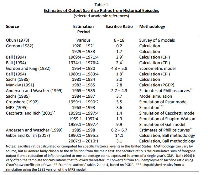
Though this seems high, it is actually at the lower end of the range of estimates. The ranges vary greatly, but all of them have a positive sign. Almost all are above 1 and most of them around in the 2-6 range as you can see in the following footnote.5 The reasons everyone thought we needed a recession to bring down inflation back in 2022 was tied to this idea that, in order to bring down inflation 1%, GDP would need to fall at least 2%.
2020s Sacrifice Ratio
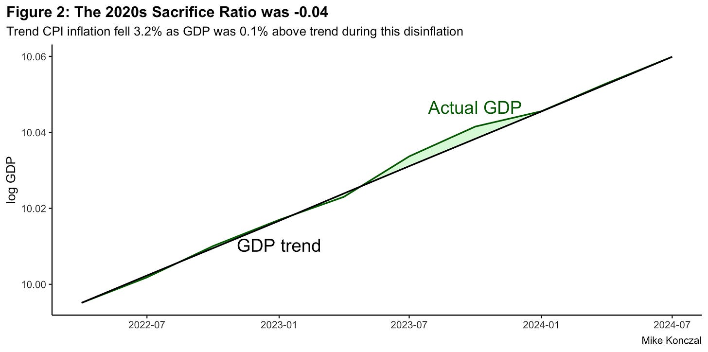
Now let’s do a modified version of this exercise for the recent few years. We can’t do the full output loss, since inflation is still falling. But there’s been a significant amount of disinflation so far and we can calculate the sacrifice ratio for that. Using that trend inflation peaked in the second quarter of 2022 and we have GDP data through the third quarter of 2024, here’s that chart:
Trend CPI falls 3.2 percentage points between second quarter 2022 to third quarter 2024. The GDP losses aren’t just small however, they are actually negative, as GDP is 0.13 percentage points above the trend line you would draw in this scenario. This gives us a sacrifice ratio of -0.04. This isn’t just vastly smaller than the 2-6 range the literature expects; it has the wrong sign from what everyone expected.
Going back to the Phillips curve, if the β term is essentially zero with expectations steady, that puts the movement in the v cost-push term. Graphing inflation versus GDP, we can see the level shift:
The blue line is GDP versus inflation for the pandemic and the red line is the same for 1991-2019. Here we see an overall shift, that, for any level of GDP growth, inflation is higher in the pandemic. This fits the cost-push Phillips curve term very well, as seen in the written-in green lines. The Phillips curve, is there anything it can’t do?
Or, to make that even clearer and adhere to the theory closer, let’s take the difference between GDP and CBO’s estimated potential GDP (an estimate we shall take with a big grain of salt) on a year-over-year basis and chart the time path:
Here you can see the story of a supply-shock. Inflation actually peaks as the output gap falls, but then inflation slows dramatically as the output gap expands. The cost-push shock term has never jumped out of a graphic faster.
Three Pushbacks
This is important evidence for the debate over what caused inflation: the demand output term or the supply cost-push shock term? (You can see Paul Krugman do a dive into this recently.) This gives more evidence to the idea of a cost-push shock being the driver. But there are three obvious pushbacks to this argument. The first is the known unknowns: inflation isn’t at target yet (and may not be soon with tariffs and chaos inbound), the data may be revised, etc. Important to track but doesn’t discount what we have here so far.
The second is that inflation expectations may have driven this disinflation.6 However I have trouble following this argument. Thinking back to the initial Phillips curve model, you can imagine that expectations aren’t adaptive but rational, that they are made on a forward looking basis rather than backwards. Thus future inflation expectations could come down, bringing down current inflation for any given level of the output.
However, long-term inflation expectations need to move one-for-one in these scenarios for it to work.7 And we simply don’t see that kind of movement in this recovery. Inflation expectations do not move up or down enough to generate the disinflation we’ve seen.
Unemployment
The third would be that unemployment has increased over the past year, and that is the better measure showing that demand is the driver. In this reading, increased unemployment was a necessary and causal driver of disinflation. What to make of this?
To clarify, another pillar of macroeconomic theory is a statistical regularity that links the output gap to the unemployment rate gap, called Okun’s law. Plugging this into the Phillips curve above gives another formulation of the sacrifice ratio in terms of unemployment:
Thus, one can do the above exercise using unemployment instead of the output gap, which may be easier to measure, especially in real-time. Assuming the natural rate of unemployment has been roughly constant since the second quarter of 2022, the unemployment rate has increased 0.6 percentage point since, from 3.6% to 4.2%, annualized to 0.3 percentage points. This implies an unemployment sacrifice ratio of 0.09, or a slope of the Phillips curve being nearly 11.
One can assume a very nonlinear Phillips curve slope of course, but as a gut check the idea that increasing unemployment 0.3% can bring down trend inflation 3 percentage points is so far outside what any prior consensus would have been. But digging in:
First, generally in these exercises the theory calls for us to look at overall output, and then extrapolate to labor since labor is the most important cost.8 And the issues of supply chains, critical inputs, and unique goods should cause us to pay extra attention to the broader economy outside the labor market too.
More, as many, many people have noted, overall real wages are falling during the peak of inflation in 2021-2022. The labor share, whose inverse is a proxy for markups, falls too. So there’s no obvious story where wages are leading prices.
Second, this unemployment sacrifice ratio is very low given pre-pandemic measures of what the slope of the unemployment Phillips curve is. There have been many estimates of what a nonlinear Phillips curve looks like, where the values become more vertical as unemployment becomes lower, and what we’ve just seen is far outside the normal range of values associated with pre-pandemic estimates. For instance Federal Reserve researchers, using metropolitan data for more variance, found some nonlinearity (Babb and Detmeister 2017) and other researchers using cubic slices at low levels of unemployment (Cooper et al 2019) found that the slope of the unemployment Phillips curve was around 0.3 to 0.42 in its nonlinear region. The slope now is nearly 11.
Third, much of this debate focuses not on unemployment but on vacancies, especially vacancies over the level of unemployment, which is quite high at the peak. We’re going to explore this more in future posts, but a few quick notes:
The data estimates are very dependent on whether it uses data from the pandemic itself in the estimates. Given the flatness of the Phillips curve since the early 1990s, anything that spikes in 2021 is likely going to explain inflation, given it is the only time inflation notably spikes.
Vacancies assume a single labor market but there are major reshuffling of different labor markets following the reopening, not to mention immigration, remote work, and more. I don’t think research has fully fleshed this out.
Even as v/u approaches 1, there’s no period where we can definitely say that v/u has been below a hypothetical v/u*; we haven’t seen a period of below target vacancies being necessary to drive down inflation as implied in a vacancies Phillips curve.
Economists will spend decades debating the global wave of inflation following the pandemic. They should approach it with open ideas: even now, the variables they have counted on for decades to guide their analysis are turning out to have the wrong signs.
Special thanks to David Ratner for feedback and edits, and Lawrence Ball for walking me through a question about his methodology.
Ball (1994) defines trend inflation as average inflation for the year before and year after a quarter, and identifies disinflation episodes as periods where this trend inflation falls by at least 2 percentage points. It treats the peak and trough of such episodes at the highest value for peak inflation and where it levels out. The amount inflation falls between the peak and trough is the total number of points that inflation fell, and forms the denominator of the sacrifice ratio.
We should flag that the measurement of CPI changes during this time period, making the early 1980s have more disinflation (and thus a lower sacrifice ratio) than what it would be if updated with current CPI measurements for housing. I keep CPI to match Ball (1994). That 1970s inflation was lower was flagged in Bolhuis, Cramer, and Summers (2022) to “imply that the current inflation regime is closer to that of the late 1970s than it may at first appear.”
This table of estimates is from (Tetlow 2022):
From a FT interview between Martin Wolf and Larry Summers, December 2024:
Larry Summers: “Inflation expectations turned out to have been really quite entrenched. And so it proved to be easier to achieve disinflation than I might have expected.” […]
Martin Wolf: “Yes, I very much take the view that inflation expectations were better anchored than I thought they would be.”
As (Hazell et al 2022) describe the theory (my bold): “This way of writing the [New Keynesian] Phillips curve highlights the importance of long-run inflation expectations in determining inflation at the aggregate level. Long-run inflation expectations Etπt+∞ appear with a coefficient of one in equation (7). In other words, current inflation moves one for one with changes in long-run inflation expectations.”
Both intermediate textbooks by Mankiw, as well as Blanchard, derive the Phillips curve from its output form and then move it, via Okun’s Law, over to unemployment. I wasn’t sure whether one should cite these textbooks as such but I noticed that the big recent Dynan and Elmendorf Peterson paper cites Mankiw to derive AS-AD curves (footnote 6).


You're right that the supply shock matters, but a good supply shock can easily lead to a negative sacrifice ratio.
The fall in inflation without unemployment could be the combination of monetary tightening and a beneficial supply shock from the supply chain problems subsiding. For some graphs to go with this story, see:
https://gdubbbb.substack.com/p/the-mysterioustearless-disinflation